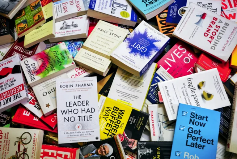
How Design in Book Shapes Reader Choice

Ever picked up a book just because it felt good to touch and see? Not because you like the author, nor did anyone recommend you to read it. Just that first look, touch, and a feeling of that one book whispering to you to take it home with you.
That is book design at work. Before we read the story, the book has already drawn our attention to it, before we even notice it. A bold cover can spark curiosity. A soft matte finish can create calm.
So, what makes your hand reach for a book?
- Is it the subtle elegance?
- Or the dramatic artwork?
Or maybe it was something you can’t even describe. Let’s find out the secrets of how to design a book cover that attracts readers.
When design speaks before words do
Long before we reach the first chapter, the book’s composition has already made an impact. It sets the tone. It frames the story. It creates an atmosphere you step into without even realising it.
- A gothic thriller with pastel florals on the cover? Ugh, your brain would definitely send an error.
- But dark, moody tones with sharp, serif typography? You will get nothing but the right vibes before you even dive into it.
Humans should be called the visual beings in the world of books. They read with the eyes before the mind. And what influences everything, including a feeling of a sprint or a long, slow sigh? The size of the book, the spacing of the text, and the rhythm of white space are what a book cover maker understands more than anyone else.

The cover
The cover of a book is its first impression. It is eye contact. It is the first greeting. You are not analysing it, but feeling it.
Sometimes the book design is a quiet whisper, other times it is a bold shout. But regardless, that moment of attraction is instantaneous. It is the book telling you who it is before you even give it a chance to explain.
How does a book’s design tell the story before you even start reading?
Colours play with emotion. Fonts play with personality. Imagery hints at the world within.
- A thriller wrapped in dark tones and sharp fonts feels inherently dangerous.
- A soft romance in warm pastels feels calm and familiar.
You can forget the author’s name, the blurb, and even the storyline, and years later, you will remember how the cover made you feel. This is not design, but storytelling before the story begins.
The layout inside
Once you are in, the story can be amazing, but if the text is tight, dense, or uneven, reading it feels like work. Good design in book understands that reading is not just mental, it is also physical. Your eyes move, your body shifts, and your breath changes.
- Brief paragraphs feel breezy.
- Wide margins feel airy.
- Line spacing can feel calming or overwhelming.
Even the weight of the paper impacts how quickly you flip the page. Light, thin pages feel fast, as though you are enjoying a story. Thicker pages compel you to slow down, enjoy, and be present.
The feel of the book
We often overlook book designing and its physical properties. It is part of the deeply personal reading experience. Before your eyes are enveloped in the story, your fingers are already forming opinions about the physical and textural characteristics of the book.
- Matteness suggests comfort and softness.
- Gloss suggests boldness and sleekness.
- Cloth-bound editions feel like history.
The feel of the book immediately suggests the kind of relationship you are going to have with that book.
How does weight come into play in its own way?
- A heavy hardcover suggests importance and invites you to sit with it instead of hurrying through it.
- A light paperback suggests a travel companion, casual, and a delight to tuck under your arm or curl up with.
We often don’t acknowledge how much size matters. Some books seem too long to be cradled and beloved. Others seem too long to remain perfectly poised on a surface for admiration.
Thick paper slows you down, making your turning each page feel intentional. Thin paper urges you through, almost as if it were beating like a heart.
What happens when design and story fall perfectly in sync?
If a book appears well-designed, your mental process immediately responds that the words inside it are worth your time. And yes, your brain does that in a matter of seconds.
- A moody, shadowy cover has you poised for suspense.
- A whimsical one prepares you to soften, to laugh, or just feel light.
When the design in book complements the story’s tone, a kind of subconscious transport occurs. You gently slip into the book’s world without even thinking. It feels seamless. Natural. Effortless.
So what happens when the design and the story clash?
You might feel a weird reading experience. You may not quite know why you hesitate to pick up the book or why your attention wanders.
This is why book design is not just pretty packaging in the industry.
- It is an experience maker.
- A mood setter.
- A non-verbal storyteller prepares the reader before the first sentence even speaks.
Why this matters more than you think
Design shapes how we feel about it. It determines if the reader will engage with the story tightly, warmly, and excitedly.
Before your brain even begins to think about the words, you’ve constructed emotional expectations based on your senses. And once that impression is formed, it will set the tone for the entire reading experience.
How does a beautifully designed book feel?
A beautifully crafted design in book will feel cohesive.
- The cover’s tone will match the story’s.
- The weight of the pages will match the pace of the plot.
- The typography will match the narrative voice.
And when everything is working well, you are not just reading the book, but entering its world. You can live in that book for a little while. You mentally keep it with you even when you don’t have it in your hands.
So, does the design matter?
Yes, design, including the book cover illustrations, matters. It matters because it impacts, silently:
- What we pick up.
- What we engage with.
- What we recall.
The story starts before the first page, and long before that, book design is the first narrator.
The reader’s truth
If you are in a bookstore or online, there are lots of stories around you. Each book promises something.
- Adventure.
- Comfort.
- Escape.
- Insight.
But what’s the first one you pick?
So, how do we make choices?
- It is not randomness.
- It is a connection.
- A visual attraction.
- A sensory yes.
- A simple moment of “this is mine.”
We like to pretend we make choices with logic, reading reviews objectively, looking at ratings, or glancing at summaries.
But the truth is very simple and not at all logical; we choose what we respond to emotionally.
Books have a way of finding us, just as stories illustrate. Subtle, instinctual, almost accidental. But not really.
So next time your hand hovers over a particular book on a shelf or your vision keeps returning to that one book… consider,
- Did you choose the story?
- Or did the story choose you?
When design aligns with the story
There is a moment when everything feels synchronised. The cover hints at the inside. The layout supports the pace. The book feels like something meant for you.
That is when design and storytelling are in harmony. It is like a soundtrack perfectly matching a scene.
This is the difference between reading because you want to, and reading because you have to. When design supports the story, the book becomes a place you enter, not just text you decode.
So, now that you know how to design a book, would you prefer to design your own book cover to connect with your reader?
Common design mistakes that break the spell
Even great stories can lose their magic if the design gets in the way. Here are the small but mighty design missteps that quietly push readers away.
- Busy covers that overwhelm instead of allure.
- Tiny fonts that make reading feel like a chore.
- Inconsistent spacing that disrupts rhythm and flow.
- A paper that is too glossy, making the glare from the light distracting.
- Overly decorative fonts that look pretty but ruin readability.
These may seem minor. But reading is a sensory experience, and one discomfort can be enough to make a reader put a book back on the shelf.
The unsung hero
White space is often the hero that goes unnoticed. It is the pause between breaths. It is the silence that lasts after the words are spoken.
Without it, everything feels dense and heavy. With it, the reading experience feels effortless, balanced, and breathable.
It is that one thing that reminds your brain to relax.
The story that begins before the words end
Design in book is the quiet storyteller behind the story. It is a Part of the book that speaks before the author gets a chance to. The cover, the layout, the texture, the typography. None of it is accidental.
All of it works together to guide your emotions, shape your expectations, and create a world you feel even before you read a single word. We don’t choose books blindly. We choose what resonates with us. What feels aligned with our mood, our personality, our inner world at that moment? And book design is the bridge that makes that connection happen.
