How to Make a Book Cover: Design Made Simple

Imagine walking into a bookstore and scanning through its countless shelves with your eyes. Suddenly, your vision is drawn to a book. The author is new to you, and you have not read through the descriptions. However, what is it that compelled you to pick it? It is the engaging cover. This is known as the power of design.
Authors pour their energy into writing each chapter of the manuscript, but without a captivating cover, there is a risk of getting lost in the crowd. To increase its sales, you want people to stop, notice, and feel curious to read. This is why you need to learn how to design a book cover that is professional yet simple and attractive.
In this blog, you will discover not only the art of creating a cover but also the hidden science behind the design choices that draw readers in. By the end, you will know how to turn your ideas into an eye-catching cover that sells your story.
Understand the Purpose of a Book Cover

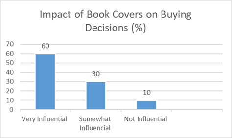
A book cover is not just a pretty picture. It is one of the silent marketing tools. Before your reader flips through the page or reads the blurb, the cover will speak to them. It narrates the story visually and helps in determining whether the story is worthy.
- The first impression is essential, as a striking cover will create an immediate interest and curiosity.
- The design will reflect the genre of the book if it is thrilling, romance, or self-defense.
- You don’t need other marketing tools when your cover design works as a promotion on social media.
- A neat and polished design will build trust and credibility with your audience.
Design Your Book Cover Like an Expert
Every genre has its own unique visual style, and determining how to create an effective book cover design requires thorough research. You need to understand the things that work to make sure that your book aligns with its readers’ expectations. For instance, a fairy tale novel cover will look different from a business guide. The key lies in understanding what works and what does not on the journey to success.
- You need to analyze your competitors and select some bestselling books in your genre to spot the design trends.
- The importance of color cannot be denied. Darker tones signal suspense, while the bright ones suggest inspirational themes.
- Each genre has some specific font types. For example, serif for classic and sans-serif for modern guides.
- When you match your design to genre norms, it prevents confusion and boosts sales.
Choose the Right Design Tool

There is no need for you to be a professional graphic artist when it comes to creative book cover designs. With the right choice of tools, the work becomes easy. There are various options available online; you need to decide which one works best for you.
Checking For The Elements Can Make It Stand Out
An attractive cover is composed of several essential elements that combine to form a unified unit. Each one plays its part in telling the story visually.
- The tile must be bold and easy to read. Choose a place where it is easily seen.
- Choose visuals that can connect the theme of the book with the readers.
- The font has some hidden secrets in your book cover. They help convey a mood, such as playful, serious, mysterious, or elegant.
- The color palette must be balanced so the cover can look visually appealing.
- Maintain a proper hierarchy in the layout, guiding the eyes from the title to the subtitle, and then to the author’s name.

Creating A Strong Title And Subtitle Design
The title is the first thing readers will notice on a book cover page design. Its presentation can either make or break the layout.
- Ensure that your titles are bold and readable even on small screens.
- There is a clear contrast between the text and the background. This ensures visibility.
- Your subtitle style should match the title, keeping a balance.
- There is a proper letter spacing that prevents text from looking crowded or stretched.
Balancing Colors For Emotional Impact
creative book cover designsColors do more than make your cover look pretty. They play with emotions. Professionals with expertise in book cover illustration state that understanding the way colors work helps you connect with your readers emotionally. Some of the colors psychology include:
- Red is used to show excitement, urgency, and power.
- Blue is for calmness, trustworthiness, and intellect.
- Green highlights growth, harmony, and balance.
- Black shows mystery, depth, and sophistication.
- Yellow reflects energy, positivity, and optimism.
| Color | Emotion Triggered | Common Genre Use |
| Red | Energy, urgency | Thrillers, romance |
| Blue | Trust, calm | Non-fiction, business |
| Green | Growth, balance | Self-help, nature |
| Black | Mystery, power | Mystery, fantasy |
| Yellow | Optimism, energy | Children’s books, guides |
Use High-Quality Images
A blurry or low-quality image will make your book look unprofessional. Deciding how to cover a book creatively with the right visuals is as critical as writing a good title.
- Use licensed platforms for stock images.
- Customize your artwork accordingly. This will add originality to your work.
- Ensure that you have chosen a high-quality resolution. This will enhance the worth of your printed version.
- Your visual choice must reflect your story and genre accurately.
Executing the Planning In a Real Application

Till now, we have explored the key ingredients of an adequate book cover. We understood its purpose and the key features, such as color selection, fonts, and images.
Planning is the initial stage, and the final step is to put all the things into practice and transform the concepts into a finished design. This will help in grabbing the attention of the readers in physical and digital bookstores.
Design for Physical vs. Digital Covers
Both the physical and digital covers have a different book cover layout, matching the demand of the audience. We must know the difference to save time and money.
- The printed covers require front, spine, and back with some specific dimensions.
- The e-book covers focus on front covers only. They are optimized for thumbnail views.
- For the bleed areas, print covers need extra margin space so you can avoid trimming issues.
- The digital covers need 72 DPI resolutions, while the printed ones work in 300 DPI.
Adding the Author Branding
Your book cover must also represent you as an author, especially when you plan to publish more titles in the future.
- Use the same fonts across all the books. This will be seen as an identity marker.
- Ensure that the series of covers shares similarities in the visuals.
- Add a personal emblem. This enhances your branding.
- Use a specific color palette. This allows your readers to identify your work.
Red Flags You Must Watch Out For
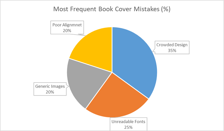
When you design your own book cover, one small error can reduce the impact of your content. Ensure that you avoid them for a professional look.
- The first and foremost important thing is that you must avoid using a book cover template. For a more personalized and original look, get into the habit of designing something that matches your book genre.
- Prevent overcrowding. Too many elements in a cover can lead to confusion.
- Choosing fancy fonts might look attractive, but they harm the clarity of your cover.
- Generic images that don’t directly align with the theme of the book reduce its originality.
- Ensure that all the elements from text to images are correctly aligned. This adds a professional look to the book.

Finalize and Test Your Cover
Before you finalize your cover, make sure that you test run it with the potential readers as your audience. Record their reactions with the book cover. Remember, feedback makes a huge difference.
- Place your designs in 3D mockups so you can visualize them on shelves.
- Design two designs and compare both versions to see which is more appealing.
- Share the feedback with the writing communities.
- After you receive the comments from the audience, be ready to make changes accordingly. It might be that you need to improve fonts, colors, or images based on the feedback.
The Final Comment
The book cover is like an invitation card to your storybook. The first impression will either pull your readers or push them away from getting their hands on it. You need to understand your book genre, choose the right tools, balance colors, and use strong typography. With all these elements, you can design a cover that speaks louder than words.
Check for common mistakes and test your cover to ensure it looks professional and ready to succeed in the market. Moreover, there are different online book cover generators available. You can scroll through them and add them to get an idea for the design. Whether you are designing it for printing or a digital format, simplicity and clarity are the keys that guide the process. A well-designed one will not just decorate your manuscript. It will transform into a book that readers want to pick up and explore.
